Interactivity
For this example we’ll use data from the World Bank once again, which we download using the WDI package.
If you want to skip the data downloading, you can download the data below (you’ll likely need to right click and choose “Save Link As…”):
Live coding example
There is no video for this one, since it really only involves feeding a few ggplot plots fed into ggplotly().
Complete code
Get and clean data
First, we load the libraries we’ll be using:
library(tidyverse)  # For ggplot, dplyr, and friends
library(WDI)        # Get data from the World Bank
library(scales)     # For nicer label formatting
library(plotly)     # For easy interactive plots
indicators <- c("SP.POP.TOTL",     # Population
                "SG.GEN.PARL.ZS",  # Proportion of seats held by women in national parliaments (%)
                "NY.GDP.PCAP.KD")  # GDP per capita

wdi_parl_raw <- WDI(country = "all", indicators, extra = TRUE,
                    start = 2000, end = 2019)
Then we clean the data by removing non-country countries and renaming some of the columns.
wdi_clean <- wdi_parl_raw %>%
  filter(region != "Aggregates") %>%
  select(iso2c, iso3c, country, year,
         population = SP.POP.TOTL,
         prop_women_parl = SG.GEN.PARL.ZS,
         gdp_per_cap = NY.GDP.PCAP.KD,
         region, income)
Creating a basic interactive chart
Let’s make a chart that shows the distribution of the proportion of women in national parliaments in 2019, by continent. We’ll use a strip plot with jittered points.
First we need to make a regular static plot with ggplot:
wdi_2019 <- wdi_clean %>%
  filter(year == 2019) %>%
  drop_na(prop_women_parl) %>%
  # Scale this down from 0-100 to 0-1 so that scales::percent() can format it as
  # an actual percent
  mutate(prop_women_parl = prop_women_parl / 100)

static_plot <- ggplot(wdi_2019,
                      aes(y = fct_rev(region), x = prop_women_parl, color = region)) +
  geom_point(position = position_jitter(width = 0, height = 0.15, seed = 1234)) +
  guides(color = "none") +
  scale_x_continuous(labels = percent) +
  # I used https://medialab.github.io/iwanthue/ to generate these colors
  scale_color_manual(values = c("#425300", "#e680ff", "#01bd71", "#ff3aad",
                                "#9f3e00", "#0146bf", "#671d56")) +
  labs(x = "% women in parliament", y = NULL, caption = "Source: The World Bank") +
  theme_bw()
static_plot
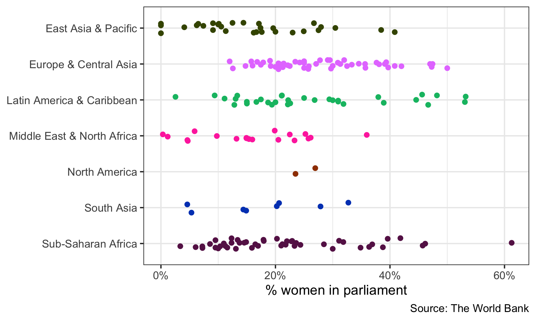
Great! That looks pretty good.
To make it interactive, all we have to do is feed the static_plot object into ggplotly(). That’s it.
ggplotly(static_plot)
Not everything translates over to JavaScript—the caption is gone now, and the legend is back (which is fine, I guess, since the legend is interactive). But still, this is magic.
Modifying the tooltip
Right now, the default tooltip you see when you hover over the points includes the actual proportion of women in parliament for each point, along with the continent, which is neat, but it’d be great if we could see the country name too. The tooltip picks up the information to include from the variables we use in aes(), and we never map the country column to any aesthetic, so it doesn’t show up.
To get around this, we can add a new aesthetic for country to the points. Instead of using one of the real ggplot aesthetics like color or fill, we’ll use a fake one called text (we can call it whatever we want! asdf would also work). ggplot has no idea how to do anything with the text aesthetic, and it’ll give you a warning, but that’s okay. The static plot looks the same:
static_plot_toolip <- ggplot(wdi_2019,
                             aes(y = fct_rev(region), x = prop_women_parl, color = region)) +
  geom_point(aes(text = country),
             position = position_jitter(width = 0, height = 0.15, seed = 1234)) +
  guides(color = "none") +
  scale_x_continuous(labels = percent) +
  # I used https://medialab.github.io/iwanthue/ to generate these colors
  scale_color_manual(values = c("#425300", "#e680ff", "#01bd71", "#ff3aad",
                                "#9f3e00", "#0146bf", "#671d56")) +
  labs(x = "% women in parliament", y = NULL, caption = "Source: The World Bank") +
  theme_bw()
## Warning: Ignoring unknown aesthetics: text
static_plot_toolip

Now we can tell plotly to use this fake text aesthetic for the tooltip:
ggplotly(static_plot_toolip, tooltip = "text")
Now we should just see the country names in the tooltips!
Including more information in the tooltip
We have country names, but we lost the values in the x-axis. Rwanda has the highest proportion of women in parliament, but what’s the exact number? It’s somewhere above 60%, but that’s all we can see now.
To fix this, we can make a new column in the data with all the text we want to include in the tooltip. We’ll use paste0() to combine text and variable values to make the tooltip follow this format:
Name of country
X% women in parliament
Let’s add a new column with mutate(). A couple things to note here:
-
The
<br>is HTML code for a line break -
We use the
percent()function to format numbers as percents. Theaccuracyargument tells R how many decimal points to use. If we used1, it would say 12%; if we used0.01, it would say 12.08%; etc.
wdi_2019 <- wdi_clean %>%
  filter(year == 2019) %>%
  drop_na(prop_women_parl) %>%
  # Scale this down from 0-100 to 0-1 so that scales::percent() can format it as
  # an actual percent
  mutate(prop_women_parl = prop_women_parl / 100) %>%
  mutate(fancy_label = paste0(country, "<br>",
                              percent(prop_women_parl, accuracy = 0.1),
                              " women in parliament"))
Let’s check to see if it worked:
wdi_2019 %>% select(country, prop_women_parl, fancy_label) %>% head()
## # A tibble: 6 × 3
##   country              prop_women_parl fancy_label
##   <chr>                          <dbl> <chr>
## 1 Andorra                        0.5   Andorra<br>50.0% women in parliament
## 2 United Arab Emirates           0.225 United Arab Emirates<br>22.5% women in parliament
## 3 Afghanistan                    0.279 Afghanistan<br>27.9% women in parliament
## 4 Antigua and Barbuda            0.111 Antigua and Barbuda<br>11.1% women in parliament
## 5 Albania                        0.295 Albania<br>29.5% women in parliament
## 6 Armenia                        0.242 Armenia<br>24.2% women in parliament
Now instead of using text = country we’ll use text = fancy_label to map that new column onto the plot. Again, this won’t be visible in the static plot (and you’ll get a warning), but it will show up in the interactive plot.
static_plot_toolip_fancy <- ggplot(wdi_2019,
                                   aes(y = fct_rev(region),
                                       x = prop_women_parl,
                                       color = region)) +
  geom_point(aes(text = fancy_label),
             position = position_jitter(width = 0, height = 0.15, seed = 1234)) +
  guides(color = "none") +
  scale_x_continuous(labels = percent) +
  # I used https://medialab.github.io/iwanthue/ to generate these colors
  scale_color_manual(values = c("#425300", "#e680ff", "#01bd71", "#ff3aad",
                                "#9f3e00", "#0146bf", "#671d56")) +
  labs(x = "% women in parliament", y = NULL, caption = "Source: The World Bank") +
  theme_bw()
## Warning: Ignoring unknown aesthetics: text
ggplotly(static_plot_toolip_fancy, tooltip = "text")
Perfect!
Finally, if we want to save this plot as a standalone self-contained HTML file, we can use the saveWidget() function from the htmlwidgets package.
# This is like ggsave, but for interactive HTML plots
interactive_plot <- ggplotly(static_plot_toolip_fancy, tooltip = "text")

htmlwidgets::saveWidget(interactive_plot, "fancy_plot.html")
Making a dashboard with flexdashboard
The documentation for flexdashboard is so great and complete that I’m not going to include a full example here. There is also a brief overview in chapter 5 of the official R Markdown book. You can also watch this really quick video here. She uses a package called dimple instead of plotly, which doesn’t work with ggplot like ggplotly(), so ignore her code about dimple() and use your ggplotly() skills instead. You can search YouTube for a bunch of other short tutorial videos, too.
The quickest and easiest way to get started is to install the flexdashboard package and then in RStudio go to File > New File… > R Markdown… > From Template > Flexdashboard:
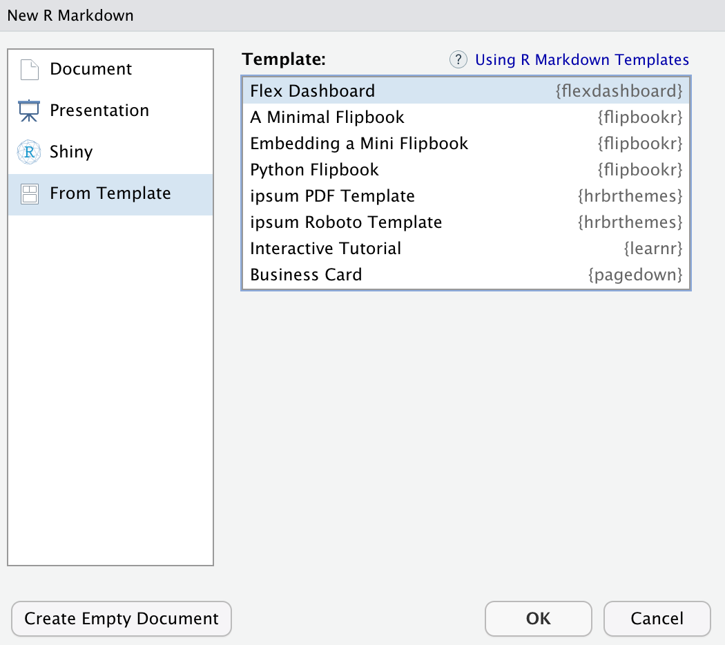
That will give you an empty dashboard with three chart areas spread across two columns. Put static or dynamic graphs in the different chart areas, knit, and you’ll be good to go!
If you’re interested in making the dashboard reactive with Shiny-like elements, check out this tutorial.