Mini project 2
The United States has resettled more than 600,000 refugees from 60 different countries since 2006.

In this mini project, you will use R, ggplot, and Illustrator, Inkscape, or Gravit Designer to explore where these refugees have come from.
Instructions
Here’s what you need to do:
-
Create a new RStudio project and place it on your computer somewhere. Open that new folder in Windows File Explorer or macOS Finder (however you navigate around the files on your computer), and create two subfolders there named
dataandoutput. -
Download the Department of Homeland Security’s annual count of people granted refugee status between 2006-2015:
Place this in the
datasubfolder you created in step 1. You might need to right click on this link and choose “Save link as…”, since your browser may try to display it as text. This data was originally uploaded by the Department of Homeland Security to Kaggle, and is provided with a public domain license. -
Create a new R Markdown file and save it in your project. In RStudio go to File > New File > R Markdown…, choose the default options, and delete all the placeholder text in the new file except for the metadata at the top, which is between
---and---. -
Verify that your project folder is structured like this:
your-project-name/ your-analysis.Rmd your-project-name.Rproj data/ refugee_status.csv output/ NOTHING -
Clean the data using the code I’ve given you below.
-
Summarize the data somehow. There is data for 60 countries over 10 years, so you’ll probably need to aggregate or reshape the data somehow (unless you do a 60-country sparkline). I’ve included some examples down below.
-
Create an appropriate time-based visualization based on the data. I’ve shown a few different ways to summarize the data so that it’s plottable down below. Don’t just calculate overall averages or totals per country—the visualization needs to deal with change over time. Do as much polishing and refining in R—make adjustments to the colors, scales, labels, grid lines, and even fonts, etc.
-
Save the figure as a PDF. Use
ggsave(plot_name, filename = "output/blah.pdf", width = XX, height = XX) -
Refine and polish the saved PDF in Illustrator or Inkscape or Gravit Designer, adding annotations, changing colors, and otherwise enhancing it.
-
Export the polished image as a PDF and a PNG file.
-
Write a memo (no word limit) explaining your process. I’m specifically looking for the following:
- What story are you telling with your graphic?
- How did you apply the principles of CRAP?
- How did you apply Kieran Healy’s principles of great visualizations or Alberto Cairo’s five qualities of great visualizations?
-
Upload the following outputs to iCollege:
- A PDF or Word file of your memo with your final code, intermediate graphic (the one you create in R), and final graphic (the one you enhance) in it. Remember to use
to place external images in Markdown. - A standalone PNG version of your graphic. You’ll export this from Illustrator or Inkscape.
- A standalone PDF version of your graphic. You’ll export this from Illustrator or Inkscape.
- A PDF or Word file of your memo with your final code, intermediate graphic (the one you create in R), and final graphic (the one you enhance) in it. Remember to use
You will be graded based on completion using the standard ✓ system, but I’ll provide comments on how you use R and ggplot2, how well you apply the principles of CRAP, The Truthful Art, and Effective Data Visualization, and how appropriate the graph is for the data and the story you’re telling. I will use this rubric to make comments and provide you with a simulated grade.
For this assignment, I am less concerned with the code (that’s why I gave most of it to you), and more concerned with the design. Choose good colors based on palettes. Choose good, clean fonts. Use the heck out of theme(). Add informative design elements in Illustrator/Inkscape/Gravit Designer. Make it look beautiful and CRAPpy. Refer to the design resources here.
The assignment is due by 11:59 PM on Monday, July 18.
Please seek out help when you need it! You know enough R (and have enough examples of code from class and your readings) to be able to do this. Your project has to be turned in individually, and your visualization should be your own (i.e. if you work with others, don’t all turn in the same graph), but you should work with others! Reach out to me for help too—I’m here to help!
You can do this, and you’ll feel like a budding dataviz witch/wizard when you’re done.
Data cleaning code
The data isn’t perfectly clean and tidy, but it’s real world data, so this is normal. Because the emphasis for this assignment is on design, not code, I’ve provided code to help you clean up the data.
These are the main issues with the data:
-
There are non-numeric values in the data, like
-,X, andD. The data isn’t very well documented; I’m assuming-indicates a missing value, but I’m not sure whatXandDmean, so for this assignment, we’ll just assume they’re also missing. -
The data generally includes rows for dozens of countries, but there are also rows for some continents, “unknown,” “other,” and a total row. Because Africa is not a country, and neither are the other continents, we want to exclude all non-countries.
-
Maintaining consistent country names across different datasets is literally the woooooooorst. Countries have different formal official names and datasets are never consistent in how they use those names.1 It’s such a tricky problem that social scientists have spent their careers just figuring out how to properly name and code countries. Really.2 There are international standards for country codes, though, like ISO 3166-1 alpha 3 (my favorite), also known as ISO3. It’s not perfect—it omits microstates (some Polynesian countries) and gray area states (Palestine, Kosovo)—but it’s an international standard, so it has that going for it.
-
To ensure that country names are consistent in this data, we use the countrycode package (install it if you don’t have it), which is amazing. The
countrycode()function will take a country name in a given coding scheme and convert it to a different coding scheme using this syntax:countrycode(variable, "current-coding-scheme", "new-coding-scheme")It also does a farily good job at guessing and parsing inconsistent country names (e.g. it will recognize “Congo, Democratic Republic”, even though it should technically be “Democratic Republic of the Congo”). Here, we use
countrycode()to convert the inconsistent country names into ISO3 codes. We then create a cleaner version of theorigin_countrycolumn by converting the ISO3 codes back into country names. Note that the function chokes on North Korea initially, since it’s included as “Korea, North”—we use thecustom_matchargument to help the function out. -
The data isn’t tidy—there are individual columns for each year.
gather()takes every column and changes it to a row. We exclude the country, region, continent, and ISO3 code from the change-into-rows transformation with-origin_country, -iso3, -origin_region, -origin_continent. -
Currently, the year is being treated as a number, but it’s helpful to also treat it as an actual date. We create a new variable named
year_datethat converts the raw number (e.g. 2009) into a date. The date needs to have at least a month, day, and year, so we actually convert it to January 1, 2009 withymd(paste0(year, "-01-01")).
library(tidyverse)    # For ggplot, dplyr, and friends
library(countrycode)  # For dealing with country names, abbreviations, and codes
library(lubridate)    # For dealing with dates
refugees_raw <- read_csv("data/refugee_status.csv", na = c("-", "X", "D"))
non_countries <- c("Africa", "Asia", "Europe", "North America", "Oceania",
                   "South America", "Unknown", "Other", "Total")

refugees_clean <- refugees_raw %>%
  # Make this column name easier to work with
  rename(origin_country = `Continent/Country of Nationality`) %>%
  # Get rid of non-countries
  filter(!(origin_country %in% non_countries)) %>%
  # Convert country names to ISO3 codes
  mutate(iso3 = countrycode(origin_country, "country.name", "iso3c",
                            custom_match = c("Korea, North" = "PRK"))) %>%
  # Convert ISO3 codes to country names, regions, and continents
  mutate(origin_country = countrycode(iso3, "iso3c", "country.name"),
         origin_region = countrycode(iso3, "iso3c", "region"),
         origin_continent = countrycode(iso3, "iso3c", "continent")) %>%
  # Make this data tidy
  gather(year, number, -origin_country, -iso3, -origin_region, -origin_continent) %>%
  # Make sure the year column is numeric + make an actual date column for years
  mutate(year = as.numeric(year),
         year_date = ymd(paste0(year, "-01-01")))
Data to possibly use in your plot
Here are some possible summaries of the data you might use…
Country totals over time
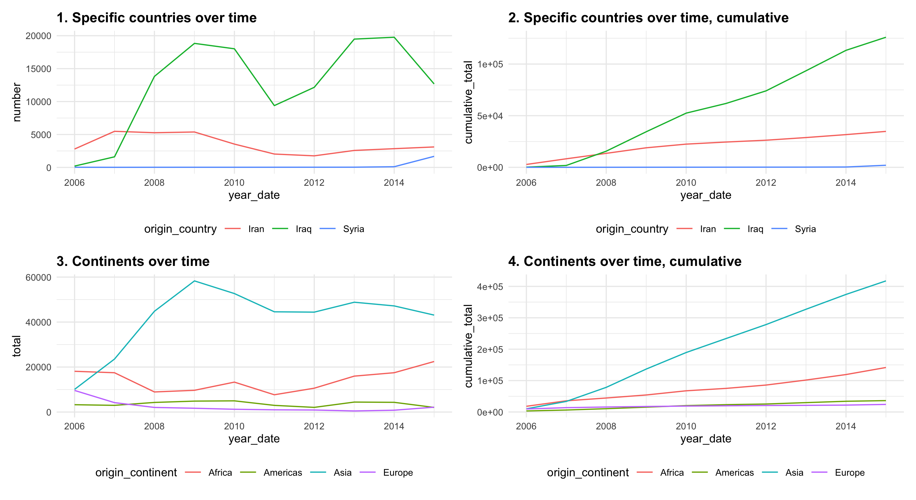
This is just the refugees_clean data frame I gave you. You’ll want to filter it and select specific countries, though—you won’t really be able to plot 60 countries all at once unless you use sparklines.
## # A tibble: 6 × 7
##   origin_country iso3  origin_region    origin_continent  year number year_date
##   <chr>          <chr> <chr>            <chr>            <dbl>  <dbl> <date>
## 1 Afghanistan    AFG   South Asia       Asia              2006    651 2006-01-01
## 2 Angola         AGO   Sub-Saharan Afr… Africa            2006     13 2006-01-01
## 3 Armenia        ARM   Europe & Centra… Asia              2006     87 2006-01-01
## 4 Azerbaijan     AZE   Europe & Centra… Asia              2006     77 2006-01-01
## 5 Belarus        BLR   Europe & Centra… Europe            2006    350 2006-01-01
## 6 Bhutan         BTN   South Asia       Asia              2006      3 2006-01-01
Cumulative country totals over time
Note the cumsum() function—it calculates the cumulative sum of a column.
refugees_countries_cumulative <- refugees_clean %>%
  arrange(year_date) %>%
  group_by(origin_country) %>%
  mutate(cumulative_total = cumsum(number))
## # A tibble: 6 × 7
## # Groups:   origin_country [1]
##   origin_country iso3  origin_continent  year number year_date  cumulative_total
##   <chr>          <chr> <chr>            <dbl>  <dbl> <date>                <dbl>
## 1 Afghanistan    AFG   Asia              2006    651 2006-01-01              651
## 2 Afghanistan    AFG   Asia              2007    441 2007-01-01             1092
## 3 Afghanistan    AFG   Asia              2008    576 2008-01-01             1668
## 4 Afghanistan    AFG   Asia              2009    349 2009-01-01             2017
## 5 Afghanistan    AFG   Asia              2010    515 2010-01-01             2532
## 6 Afghanistan    AFG   Asia              2011    428 2011-01-01             2960
Continent totals over time
Note the na.rm = TRUE argument in sum(). This makes R ignore any missing data when calculating the total. Without it, if R finds a missing value in the column, it will mark the final sum as NA too, which we don’t want.
refugees_continents <- refugees_clean %>%
  group_by(origin_continent, year_date) %>%
  summarize(total = sum(number, na.rm = TRUE))
## # A tibble: 6 × 3
## # Groups:   origin_continent [1]
##   origin_continent year_date  total
##   <chr>            <date>     <dbl>
## 1 Africa           2006-01-01 18116
## 2 Africa           2007-01-01 17473
## 3 Africa           2008-01-01  8931
## 4 Africa           2009-01-01  9664
## 5 Africa           2010-01-01 13303
## 6 Africa           2011-01-01  7677
Cumulative continent totals over time
Note that there are two group_by() functions here. First we get the total number of refugees per continent per year, then we group by continent only to get the cumulative sum of refugees across continents.
refugees_continents_cumulative <- refugees_clean %>%
  group_by(origin_continent, year_date) %>%
  summarize(total = sum(number, na.rm = TRUE)) %>%
  arrange(year_date) %>%
  group_by(origin_continent) %>%
  mutate(cumulative_total = cumsum(total))
## # A tibble: 6 × 4
## # Groups:   origin_continent [1]
##   origin_continent year_date  total cumulative_total
##   <chr>            <date>     <dbl>            <dbl>
## 1 Africa           2006-01-01 18116            18116
## 2 Africa           2007-01-01 17473            35589
## 3 Africa           2008-01-01  8931            44520
## 4 Africa           2009-01-01  9664            54184
## 5 Africa           2010-01-01 13303            67487
## 6 Africa           2011-01-01  7677            75164
Visualization ideas
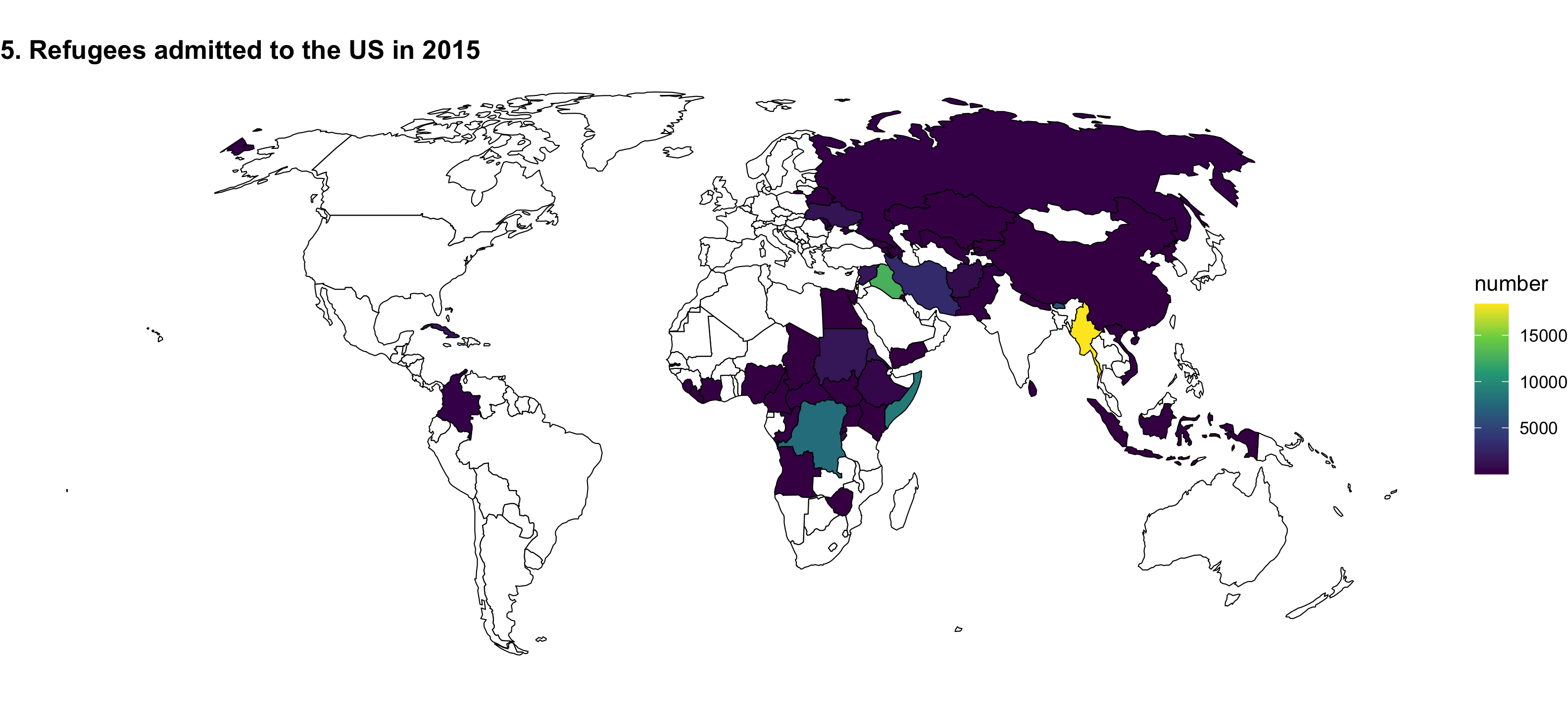
You can redesign one of these ugly, less-than-helpful graphs, or create a brand new visualization (like a map!).
Or be super brave and make a map!
-
For instance, “North Korea”, “Korea, North”, “DPRK”, “Korea, Democratic People’s Republic of”, and “Democratic People’s Republic of Korea”, and “Korea (DPRK)” are all perfectly normal versions of the country’s name and you’ll find them all in the wild. ↩︎
-
See Gleditsch, Kristian S. & Michael D. Ward. 1999. “Interstate System Membership: A Revised List of the Independent States since 1816." International Interactions 25: 393-413; or the “ICOW Historical State Names Data Set”. ↩︎