class: center middle main-title section-title-4 # Mapping Data<br>to Graphics .class-info[ **Session 3** .light[PMAP 8921: Data Visualization with R<br> Andrew Young School of Policy Studies<br> Summer 2022] ] --- name: outline class: title title-inv-7 # Plan for today -- .box-4.medium.sp-after-half[Data, aesthetics, & the grammar of graphics] -- .box-2.medium.sp-after-half[Grammatical layers] -- .box-3.medium.sp-after-half[Aesthetics in extra dimensions] -- .box-6.medium[Tidy data] --- name: grammar-of-graphics class: center middle section-title section-title-4 animated fadeIn # Data, aesthetics,<br>& the grammar of graphics --- class: bg-full bg-y-75 background-image: url("img/03/napoleon-retreat.jpg") ??? Source: [Wikipedia](https://en.wikipedia.org/wiki/File:National_Museum_in_Poznan_-_Przej%C5%9Bcie_przez_Berezyn%C4%99.JPG) --- layout: true class: title title-4 --- # Long distance! .center[ <figure> <img src="img/03/napoleon-google-maps.png" alt="Moscow to Vilnius" title="Moscow to Vilnius" width="80%"> <figcaption>Moscow to Vilnius</figcaption> </figure> ] --- # Very cold! <img src="03-slides_files/figure-html/minard-temps-1.png" width="864" style="display: block; margin: auto;" /> --- # Lots of people died! <img src="03-slides_files/figure-html/minard-deaths-1.png" width="468" style="display: block; margin: auto;" /> --- layout: false class: bg-full background-image: url("img/03/minard.png") ??? Source: [Wikimedia Commons](https://upload.wikimedia.org/wikipedia/commons/2/29/Minard.png) --- layout: true class: title title-4 --- # Mapping data to aesthetics .pull-left.center[ <figure> <img src="img/03/gg-book.jpg" alt="ZZZ" title="ZZZ" width="55%"> </figure> ] .pull-right[ .box-inv-4.medium[Aesthetic] .box-4[Visual property of a graph] .box-4.sp-after[Position, shape, color, etc.] .box-inv-4.medium[Data] .box-4[A column in a dataset] ] --- # Mapping data to aesthetics <table> <tr> <th class="cell-left">Data</th> <th class="cell-left">Aesthetic</th> <th class="cell-left">Graphic/Geometry</th> </tr> <tr> <td class="cell-left">Longitude</td> <td class="cell-left">Position (x-axis) </td> <td class="cell-left">Point</td> </tr> <tr> <td class="cell-left">Latitude</td> <td class="cell-left">Position (y-axis)</td> <td class="cell-left">Point</td> </tr> <tr> <td class="cell-left">Army size</td> <td class="cell-left">Size</td> <td class="cell-left">Path</td> </tr> <tr> <td class="cell-left">Army direction </td> <td class="cell-left">Color</td> <td class="cell-left">Path</td> </tr> <tr> <td class="cell-left">Date</td> <td class="cell-left">Position (x-axis)</td> <td class="cell-left">Line + text</td> </tr> <tr> <td class="cell-left">Temperature</td> <td class="cell-left">Position (y-axis)</td> <td class="cell-left">Line + text</td> </tr> </table> --- # Mapping data to aesthetics <table> <tr> <th class="cell-left">Data</th> <th class="cell-left"><code class="remark-inline-code">aes()</code></th> <th class="cell-left"><code class="remark-inline-code">geom</code></th> </tr> <tr> <td class="cell-left">Longitude</td> <td class="cell-left"><code class="remark-inline-code">x</code></td> <td class="cell-left"><code class="remark-inline-code">geom_point()</code></td> </tr> <tr> <td class="cell-left">Latitude</td> <td class="cell-left"><code class="remark-inline-code">y</code></td> <td class="cell-left"><code class="remark-inline-code">geom_point()</code></td> </tr> <tr> <td class="cell-left">Army size</td> <td class="cell-left"><code class="remark-inline-code">size</code></td> <td class="cell-left"><code class="remark-inline-code">geom_path()</code></td> </tr> <tr> <td class="cell-left">Army direction </td> <td class="cell-left"><code class="remark-inline-code">color</code> </td> <td class="cell-left"><code class="remark-inline-code">geom_path()</code></td> </tr> <tr> <td class="cell-left">Date</td> <td class="cell-left"><code class="remark-inline-code">x</code></td> <td class="cell-left"><code class="remark-inline-code">geom_line() + geom_text()</code></td> </tr> <tr> <td class="cell-left">Temperature</td> <td class="cell-left"><code class="remark-inline-code">y</code></td> <td class="cell-left"><code class="remark-inline-code">geom_line() + geom_text()</code></td> </tr> </table> --- # `ggplot()` template -- --- layout: false .box-4[This is a dataset named `troops`:] .small[ <table> <thead> <tr> <th style="text-align:left;"> longitude </th> <th style="text-align:left;"> latitude </th> <th style="text-align:left;"> direction </th> <th style="text-align:left;"> survivors </th> </tr> </thead> <tbody> <tr> <td style="text-align:left;"> 24 </td> <td style="text-align:left;"> 54.9 </td> <td style="text-align:left;"> A </td> <td style="text-align:left;"> 340000 </td> </tr> <tr> <td style="text-align:left;"> 24.5 </td> <td style="text-align:left;"> 55 </td> <td style="text-align:left;"> A </td> <td style="text-align:left;"> 340000 </td> </tr> <tr> <td style="text-align:left;"> … </td> <td style="text-align:left;"> … </td> <td style="text-align:left;"> … </td> <td style="text-align:left;"> … </td> </tr> </tbody> </table> ] -- --- <img src="03-slides_files/figure-html/show-basic-minard-1.png" width="100%" style="display: block; margin: auto;" /> --- class: bg-full background-image: url("img/03/rosling-tedx.jpg") ??? Source: [New York Times](https://www.nytimes.com/2017/02/09/world/europe/hans-rosling-dead-statistician.html) --- class: bg-full background-image: url("img/03/gapminder-screenshot.png") ??? Source: [Gapminder](https://www.gapminder.org/tools/#$chart-type=bubbles) --- layout: true class: title title-4 --- # Mapping data to aesthetics <table> <tr> <th class="cell-left">Data</th> <th class="cell-left"><code class="remark-inline-code">aes()</code></th> <th class="cell-left"><code class="remark-inline-code">geom</code></th> </tr> <tr> <td class="cell-left">Wealth (GDP/capita)</td> <td class="cell-left"><code class="remark-inline-code">x</code></td> <td class="cell-left"><code class="remark-inline-code">geom_point()</code></td> </tr> <tr> <td class="cell-left">Health (Life expectancy) </td> <td class="cell-left"><code class="remark-inline-code">y</code></td> <td class="cell-left"><code class="remark-inline-code">geom_point()</code></td> </tr> <tr> <td class="cell-left">Continent</td> <td class="cell-left"><code class="remark-inline-code">color</code></td> <td class="cell-left"><code class="remark-inline-code">geom_point()</code></td> </tr> <tr> <td class="cell-left">Population</td> <td class="cell-left"><code class="remark-inline-code">size</code> </td> <td class="cell-left"><code class="remark-inline-code">geom_point()</code></td> </tr> </table> --- layout: false .box-4[This is a dataset named `gapminder_2007`:] .small[ <table> <thead> <tr> <th style="text-align:center;"> country </th> <th style="text-align:center;"> continent </th> <th style="text-align:center;"> gdpPercap </th> <th style="text-align:center;"> lifeExp </th> <th style="text-align:center;"> pop </th> </tr> </thead> <tbody> <tr> <td style="text-align:center;"> Afghanistan </td> <td style="text-align:center;"> Asia </td> <td style="text-align:center;"> 974.5803384 </td> <td style="text-align:center;"> 43.828 </td> <td style="text-align:center;"> 31889923 </td> </tr> <tr> <td style="text-align:center;"> Albania </td> <td style="text-align:center;"> Europe </td> <td style="text-align:center;"> 5937.029526 </td> <td style="text-align:center;"> 76.423 </td> <td style="text-align:center;"> 3600523 </td> </tr> <tr> <td style="text-align:center;"> … </td> <td style="text-align:center;"> … </td> <td style="text-align:center;"> … </td> <td style="text-align:center;"> … </td> <td style="text-align:center;"> … </td> </tr> </tbody> </table> ] -- --- layout: true class: title title-4 --- # Health and wealth <img src="03-slides_files/figure-html/show-basic-gapminder-1.png" width="100%" style="display: block; margin: auto;" /> --- layout: false name: grammatical-layers class: center middle section-title section-title-2 animated fadeIn # Grammatical layers --- layout: true class: title title-2 --- # Grammar components as layers .pull-left[ .box-inv-2[So far we know about data, aesthetics, and geometries] .box-inv-2[Think of these<br>components as **layers**] .box-inv-2[Add them to foundational `ggplot()` with `+`] ] .pull-right[  ] ??? Layer analogy borrowed from [Thomas Lin Pedersen](https://www.data-imaginist.com/) and his ["Drawing Anything with ggplot2" workshop](https://github.com/thomasp85/ggplot2_workshop). --- # Possible aesthetics .pull-left-3[ .box-inv-2.small[`color` (discrete)] <img src="03-slides_files/figure-html/aes-color-discrete-1.png" width="100%" style="display: block; margin: auto;" /> .box-inv-2.small[`color` (continuous)] <img src="03-slides_files/figure-html/aes-color-continuous-1.png" width="100%" style="display: block; margin: auto;" /> ] .pull-middle-3[ .box-inv-2.small[`size`] <img src="03-slides_files/figure-html/aes-size-1.png" width="100%" style="display: block; margin: auto;" /> .box-inv-2.small[`fill`] <img src="03-slides_files/figure-html/aes-fill-1.png" width="100%" style="display: block; margin: auto;" /> ] .pull-right-3[ .box-inv-2.small[`shape`] <img src="03-slides_files/figure-html/aes-shape-1.png" width="100%" style="display: block; margin: auto;" /> .box-inv-2.small[`alpha`] <img src="03-slides_files/figure-html/aes-alpha-1.png" width="100%" style="display: block; margin: auto;" /> ] --- # Possible geoms <table> <tr> <th class="cell-left"></th> <th class="cell-left">Example geom</th> <th class="cell-left">What it makes</th> </tr> <tr> <td class="cell-left"><img src="img/03/geom_bar.png"></td> <td class="cell-left"><code class="remark-inline-code">geom_col()</code></td> <td class="cell-left">Bar charts</td> </tr> <tr> <td class="cell-left"><img src="img/03/geom_text.png"></td> <td class="cell-left"><code class="remark-inline-code">geom_text()</code></td> <td class="cell-left">Text</td> </tr> <tr> <td class="cell-left"><img src="img/03/geom_point.png"></td> <td class="cell-left"><code class="remark-inline-code">geom_point()</code></td> <td class="cell-left">Points</td> </tr> <tr> <td class="cell-left"><img src="img/03/geom_boxplot.png"></td> <td class="cell-left"><code class="remark-inline-code">geom_boxplot()</code> </td> <td class="cell-left">Boxplots</td> </tr> <tr> <td class="cell-left"><img src="img/03/geom_sf.png"></td> <td class="cell-left"><code class="remark-inline-code">geom_sf()</code></td> <td class="cell-left">Maps</td> </tr> </table> --- # Possible geoms .box-inv-2[There are dozens of possible geoms and<br>each class session will cover different ones.] .box-2[See [the **ggplot2** documentation](https://ggplot2.tidyverse.org/reference/index.html#section-layer-geoms) for<br>complete examples of all the different geom layers] --- # Additional layers .pull-left[ .box-inv-2[There are many of other grammatical layers we can use to describe graphs!] .box-inv-2[We sequentially add layers onto the foundational `ggplot()` plot to create complex figures] ] .pull-right[ 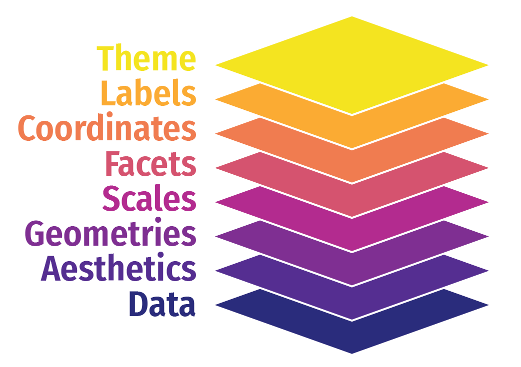 ] --- # Scales .box-inv-2[Scales change the properties of the variable mapping] <table> <tr> <th class="cell-left">Example layer</th> <th class="cell-left">What it does</th> </tr> <tr> <td class="cell-left"><code class="remark-inline-code">scale_x_continuous()</code></td> <td class="cell-left">Make the x-axis continuous</td> </tr> <tr> <td class="cell-left"><code class="remark-inline-code">scale_x_continuous(breaks = 1:5) </code></td> <td class="cell-left">Manually specify axis ticks</td> </tr> <tr> <td class="cell-left"><code class="remark-inline-code">scale_x_log10()</code></td> <td class="cell-left">Log the x-axis</td> </tr> <tr> <td class="cell-left"><code class="remark-inline-code">scale_color_gradient()</code></td> <td class="cell-left">Use a gradient</td> </tr> <tr> <td class="cell-left"><code class="remark-inline-code">scale_fill_viridis_d()</code></td> <td class="cell-left">Fill with discrete viridis colors</td> </tr> </table> --- # Scales .pull-left[ .box-inv-2.small[`scale_x_log10()`] <img src="03-slides_files/figure-html/scale-example-1-1.png" width="100%" style="display: block; margin: auto;" /> ] -- .pull-right[ .box-inv-2.small[`scale_color_viridis_d()`] <img src="03-slides_files/figure-html/scale-example-2-1.png" width="100%" style="display: block; margin: auto;" /> ] --- # Facets .box-inv-2[Facets show subplots for different subsets of data] <table> <tr> <th class="cell-left">Example layer</th> <th class="cell-left">What it does</th> </tr> <tr> <td class="cell-left"><code class="remark-inline-code">facet_wrap(vars(continent))</code></td> <td class="cell-left">Plot for each continent</td> </tr> <tr> <td class="cell-left"><code class="remark-inline-code">facet_wrap(vars(continent, year))</code> </td> <td class="cell-left">Plot for each continent/year</td> </tr> <tr> <td class="cell-left"><code class="remark-inline-code">facet_wrap(..., ncol = 1)</code></td> <td class="cell-left">Put all facets in one column</td> </tr> <tr> <td class="cell-left"><code class="remark-inline-code">facet_wrap(..., nrow = 1)</code></td> <td class="cell-left">Put all facets in one row</td> </tr> </table> --- # Facets .pull-left[ .box-inv-2.small[`facet_wrap(vars(continent))`] <img src="03-slides_files/figure-html/facet-example-1-1.png" width="100%" style="display: block; margin: auto;" /> ] -- .pull-right[ .box-inv-2.small[`facet_wrap(vars(continent, year))`] <img src="03-slides_files/figure-html/facet-example-2-1.png" width="100%" style="display: block; margin: auto;" /> ] --- # Coordinates .box-inv-2[Change the coordinate system] <table> <tr> <th class="cell-left">Example layer</th> <th class="cell-left">What it does</th> </tr> <tr> <td class="cell-left"><code class="remark-inline-code">coord_cartesian()</code></td> <td class="cell-left">Plot for each continent</td> </tr> <tr> <td class="cell-left"><code class="remark-inline-code">coord_cartesian(ylim = c(1, 10))</code> </td> <td class="cell-left">Zoom in where y is 1–10</td> </tr> <tr> <td class="cell-left"><code class="remark-inline-code">coord_flip()</code></td> <td class="cell-left">Switch x and y</td> </tr> <tr> <td class="cell-left"><code class="remark-inline-code">coord_polar()</code></td> <td class="cell-left">Use circular polar system</td> </tr> </table> --- # Coordinates .pull-left[ .box-inv-2.small[`coord_cartesian(ylim = c(70, 80), xlim = c(10000, 30000))`] <img src="03-slides_files/figure-html/coord-example-1-1.png" width="100%" style="display: block; margin: auto;" /> ] -- .pull-right[ .box-inv-2.small[`coord_flip()`] <img src="03-slides_files/figure-html/coord-example-2-1.png" width="100%" style="display: block; margin: auto;" /> ] --- # Labels .box-inv-2[Add labels to the plot with a single `labs()` layer] <table> <tr> <th class="cell-left">Example layer</th> <th class="cell-left">What it does</th> </tr> <tr> <td class="cell-left"><code class="remark-inline-code">labs(title = "Neat title")</code></td> <td class="cell-left">Title</td> </tr> <tr> <td class="cell-left"><code class="remark-inline-code">labs(caption = "Something")</td> <td class="cell-left">Caption</td> </tr> <tr> <td class="cell-left"><code class="remark-inline-code">labs(y = "Something")</td> <td class="cell-left">y-axis</td> </tr> <tr> <td class="cell-left"><code class="remark-inline-code">labs(size = "Population")</code></td> <td class="cell-left">Title of size legend</td> </tr> </table> --- # Labels .left-code[ ```r ggplot(gapminder_2007, aes(x = gdpPercap, y = lifeExp, color = continent, size = pop)) + geom_point() + scale_x_log10() + labs(title = "Health and wealth grow together", subtitle = "Data from 2007", x = "Wealth (GDP per capita)", y = "Health (life expectancy)", color = "Continent", size = "Population", caption = "Source: The Gapminder Project") ``` ] .right-plot[ 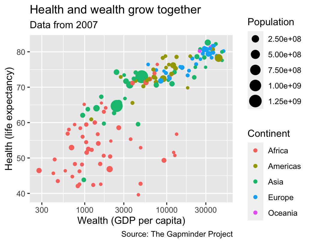 ] --- # Theme .box-inv-2[Change the appearance of anything in the plot] .box-2[There are many built-in themes] <table> <tr> <th class="cell-left">Example layer</th> <th class="cell-left">What it does</th> </tr> <tr> <td class="cell-left"><code class="remark-inline-code">theme_grey()</code></td> <td class="cell-left">Default grey background</td> </tr> <tr> <td class="cell-left"><code class="remark-inline-code">theme_bw()</td> <td class="cell-left">Black and white</td> </tr> <tr> <td class="cell-left"><code class="remark-inline-code">theme_dark()</td> <td class="cell-left">Dark</td> </tr> <tr> <td class="cell-left"><code class="remark-inline-code">theme_minimal()</code></td> <td class="cell-left">Minimal</td> </tr> </table> --- # Theme .pull-left[ .box-inv-2.small[`theme_dark()`] <img src="03-slides_files/figure-html/theme-example-1-1.png" width="100%" style="display: block; margin: auto;" /> ] -- .pull-right[ .box-inv-2.small[`theme_minimal()`] <img src="03-slides_files/figure-html/theme-example-2-1.png" width="100%" style="display: block; margin: auto;" /> ] --- # Theme .box-inv-2[There are collections of pre-built themes online,<br>like [the **ggthemes** package](https://jrnold.github.io/ggthemes/)] .center[ <figure> <img src="img/03/ggthemes.png" alt="ggthemes" title="ggthemes" width="45%"> </figure> ] --- # Theme .box-inv-2[Organizations often make their own custom themes, [like the BBC](https://bbc.github.io/rcookbook/)] .center[ <figure> <img src="img/03/bbc-cookbook.png" alt="ggthemes" title="ggthemes" width="80%"> </figure> ] --- # Theme options .box-inv-2[Make theme adjustments with `theme()`] .box-2[There are a billion options here!<br>We have a whole class session dedicated to this!] ```r theme_bw() + theme(legend.position = "bottom", plot.title = element_text(face = "bold"), panel.grid = element_blank(), axis.title.y = element_text(face = "italic")) ``` --- # So many possibilities! .pull-left[  ] .pull-right[ .box-inv-2[These were just a few examples of layers!] .box-2[See [the **ggplot2** documentation](https://ggplot2.tidyverse.org/reference/index.html) for<br>complete examples of everything you can do] ] --- # Putting it all together .box-inv-2.medium[We can build a plot sequentially<br>to see how each grammatical layer<br>changes the appearance] --- layout: false .left-code[ .box-2[Start with data and aesthetics] ```r *ggplot(data = mpg, * mapping = aes(x = displ, * y = hwy, * color = drv)) ``` ] .right-plot[  ] --- .left-code[ .box-2[Add a point geom] ```r ggplot(data = mpg, mapping = aes(x = displ, y = hwy, color = drv)) + * geom_point() ``` ] .right-plot[  ] --- .left-code[ .box-2[Add a smooth geom] ```r ggplot(data = mpg, mapping = aes(x = displ, y = hwy, color = drv)) + geom_point() + * geom_smooth() ``` ] .right-plot[  ] --- .left-code[ .box-2[Make it straight] ```r ggplot(data = mpg, mapping = aes(x = displ, y = hwy, color = drv)) + geom_point() + * geom_smooth(method = "lm") ``` ] .right-plot[  ] --- .left-code[ .box-2[Use a viridis color scale] ```r ggplot(data = mpg, mapping = aes(x = displ, y = hwy, color = drv)) + geom_point() + geom_smooth(method = "lm") + * scale_color_viridis_d() ``` ] .right-plot[  ] --- .left-code[ .box-2[Facet by drive] ```r ggplot(data = mpg, mapping = aes(x = displ, y = hwy, color = drv)) + geom_point() + geom_smooth(method = "lm") + scale_color_viridis_d() + * facet_wrap(vars(drv), ncol = 1) ``` ] .right-plot[  ] --- .left-code[ .box-2[Add labels] ```r ggplot(data = mpg, mapping = aes(x = displ, y = hwy, color = drv)) + geom_point() + geom_smooth(method = "lm") + scale_color_viridis_d() + facet_wrap(vars(drv), ncol = 1) + * labs(x = "Displacement", y = "Highway MPG", * color = "Drive", * title = "Heavier cars get lower mileage", * subtitle = "Displacement indicates weight(?)", * caption = "I know nothing about cars") ``` ] .right-plot[ 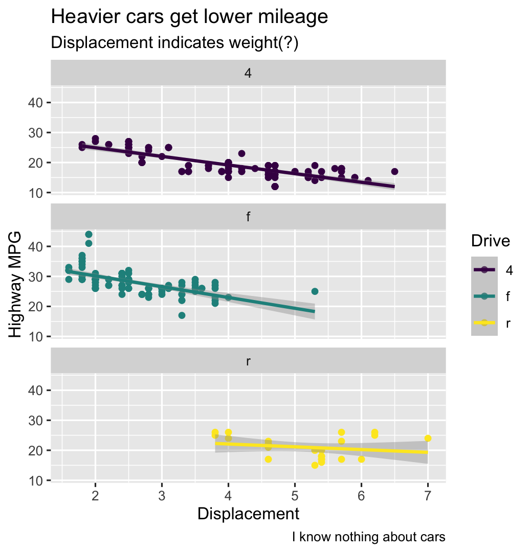 ] --- .left-code[ .box-2[Add a theme] ```r ggplot(data = mpg, mapping = aes(x = displ, y = hwy, color = drv)) + geom_point() + geom_smooth(method = "lm") + scale_color_viridis_d() + facet_wrap(vars(drv), ncol = 1) + labs(x = "Displacement", y = "Highway MPG", color = "Drive", title = "Heavier cars get lower mileage", subtitle = "Displacement indicates weight(?)", caption = "I know nothing about cars") + * theme_bw() ``` ] .right-plot[ 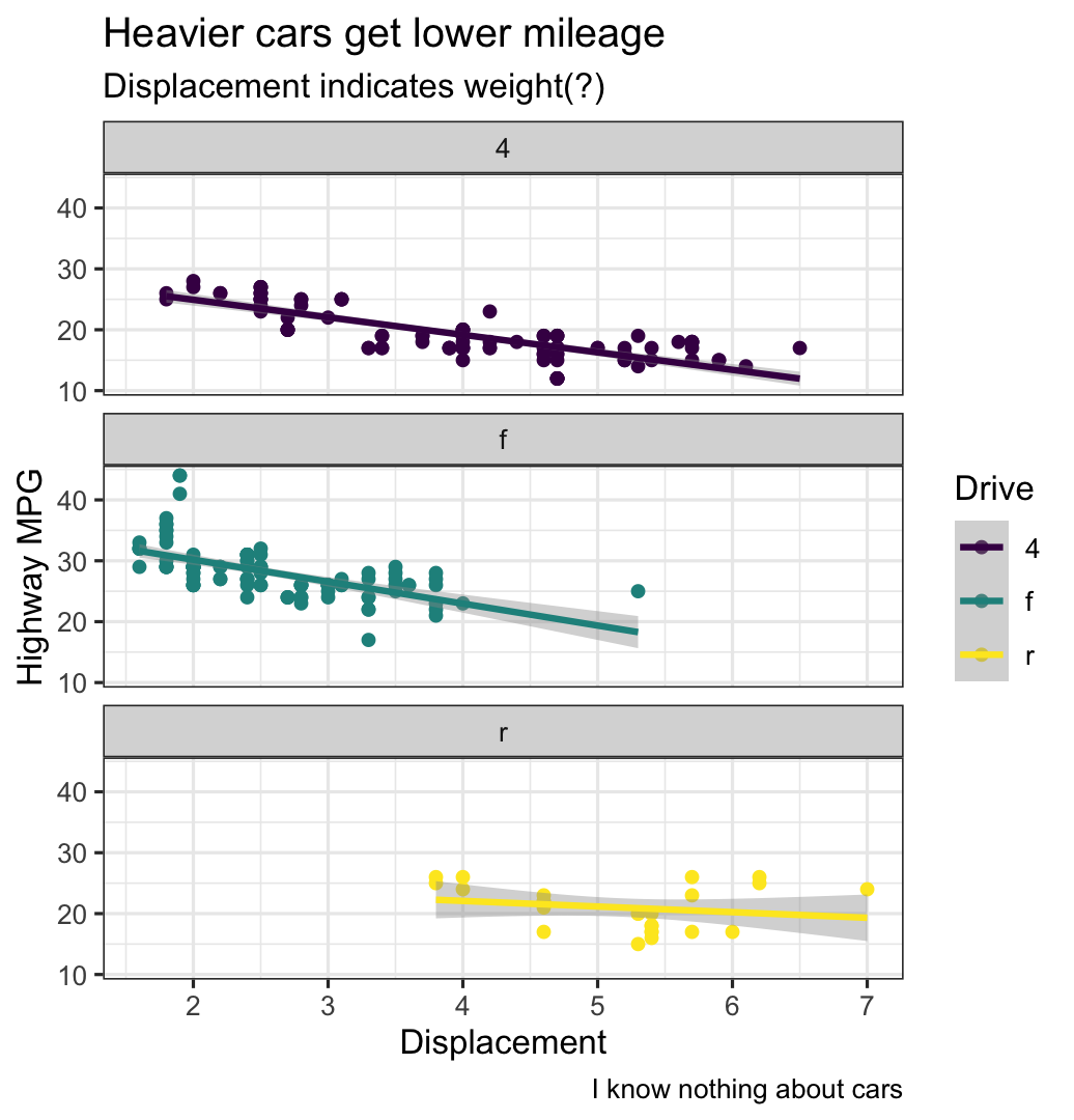 ] --- .left-code[ .box-2[Modify the theme] ```r ggplot(data = mpg, mapping = aes(x = displ, y = hwy, color = drv)) + geom_point() + geom_smooth(method = "lm") + scale_color_viridis_d() + facet_wrap(vars(drv), ncol = 1) + labs(x = "Displacement", y = "Highway MPG", color = "Drive", title = "Heavier cars get lower mileage", subtitle = "Displacement indicates weight(?)", caption = "I know nothing about cars") + theme_bw() + * theme(legend.position = "bottom", * plot.title = element_text(face = "bold")) ``` ] .right-plot[  ] --- .left-code[ .box-2[Finished!] ```r ggplot(data = mpg, mapping = aes(x = displ, y = hwy, color = drv)) + geom_point() + geom_smooth(method = "lm") + scale_color_viridis_d() + facet_wrap(vars(drv), ncol = 1) + labs(x = "Displacement", y = "Highway MPG", color = "Drive", title = "Heavier cars get lower mileage", subtitle = "Displacement indicates weight(?)", caption = "I know nothing about cars") + theme_bw() + theme(legend.position = "bottom", plot.title = element_text(face = "bold")) ``` ] .right-plot[ 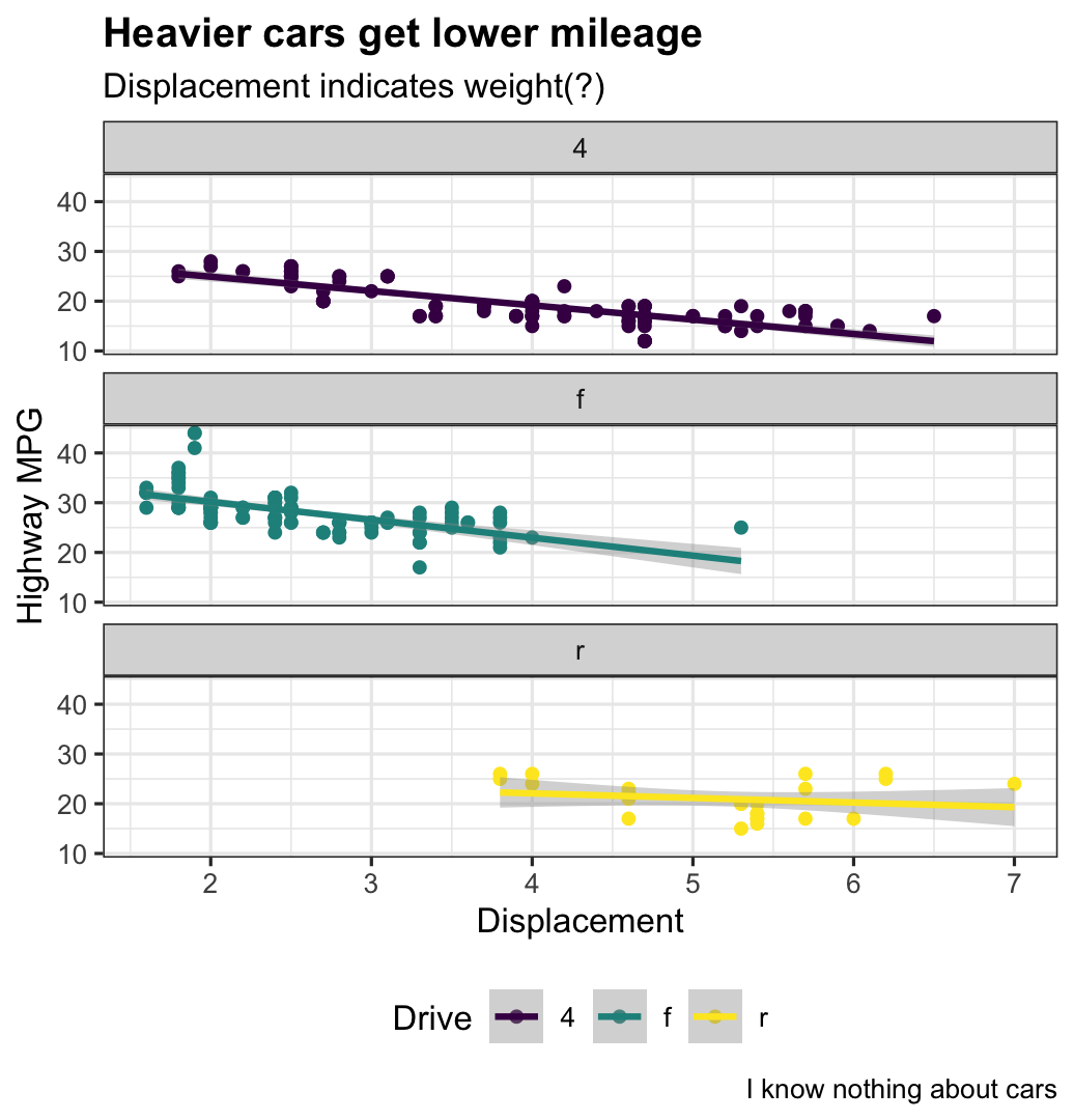 ] --- layout: true class: title title-2 --- # A true grammar .pull-left[ .box-inv-2[With the grammar of graphics, we don't talk about specific chart *types*] .box-2.small[Hunt through Excel menus for a stacked bar chart and manually reshape your data to work with it] ] .pull-right[ .center[ <figure> <img src="img/03/excel-chart-types.png" alt="Excel chart types" title="Excel chart types" width="78%"> </figure> ] ] --- # A true grammar .pull-left[ .box-inv-2[With the grammar of graphics, we *do* talk about specific chart *elements*] .box-2.small[Map a column to the x-axis, fill by a different variable, and `geom_col()` to get stacked bars] .box-2.small[Geoms can be interchangable<br>(e.g. switch `geom_violin()` to `geom_boxplot()`)] ] .pull-right[ .center[ <figure> <img src="img/03/ggplot-layers@4x.png" alt="Grammar of graphics layers" title="Grammar of graphics layers" width="100%"> </figure> ] ] --- # Describing graphs with the grammar .left-code[ .box-2.small[Map wealth to the x-axis, health to the y-axis, add points, color by continent, size by population, scale the y-axis with a log, and facet by year] ```r ggplot(data = filter(gapminder, year %in% c(2002, 2007)), mapping = aes(x = gdpPercap, y = lifeExp, color = continent, size = pop)) + geom_point() + scale_x_log10() + facet_wrap(vars(year), ncol = 1) ``` ] .right-plot[ 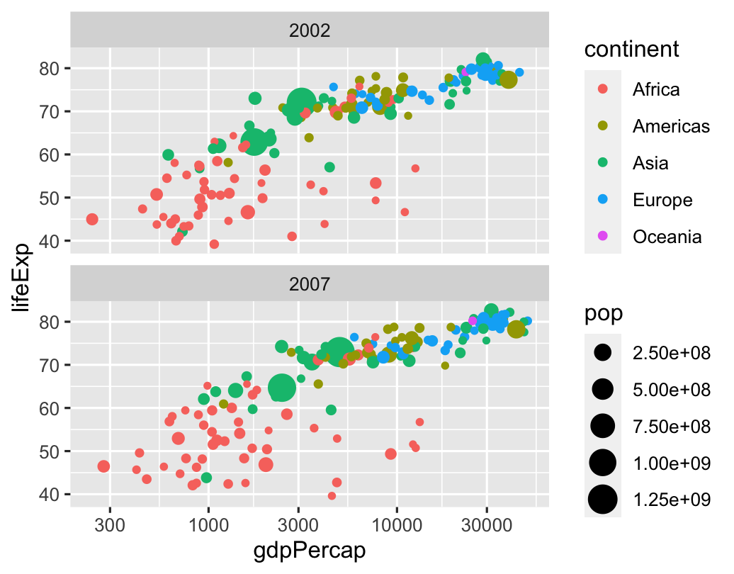 ] --- # Describing graphs with the grammar .left-code[ .box-2.small[Map health to the x-axis, add a histogram with bins for every 5 years, fill and facet by continent] ```r ggplot(data = gapminder_2007, mapping = aes(x = lifeExp, fill = continent)) + geom_histogram(binwidth = 5, color = "white") + guides(fill = "none") + # Turn off legend facet_wrap(vars(continent)) ``` ] .right-plot[  ] --- # Describing graphs with the grammar .left-code[ .box-2.small[Map continent to the x-axis, health to the y-axis, add violin plots and semi-transparent boxplots, fill by continent] ```r ggplot(data = gapminder, mapping = aes(x = continent, y = lifeExp, fill = continent)) + geom_violin() + geom_boxplot(alpha = 0.5) + guides(fill = "none") # Turn off legend ``` ] .right-plot[  ] --- layout: false name: extra-dimensions class: center middle section-title section-title-3 animated fadeIn # Aesthetics in<br>extra dimensions --- layout: true class: title title-3 --- # Time .left-code[ .box-inv-3[Use **gganimate** to map variables to a time aesthetic] ```r ggplot(gapminder, aes(x = gdpPercap, y = lifeExp, size = pop, color = country)) + geom_point(alpha = 0.7) + scale_size(range = c(2, 12)) + scale_x_log10(labels = scales::dollar) + guides(size = "none", color = "none") + facet_wrap(~continent) + # Special gganimate stuff labs(title = 'Year: {frame_time}', x = 'GDP per capita', y = 'life expectancy') + transition_time(year) + ease_aes('linear') ``` ] .right-plot[  ] --- # Sound .box-inv-3[Visualize internal rhyming schemes in music] .box-3.small[<http://graphics.wsj.com/hamilton/>] .center[ <figure> <img src="img/03/hamilton.png" alt="Daveed Diggs in 'Washington On Your Side'" title="Daveed Diggs in 'Washington On Your Side'" width="60%"> </figure> ] --- layout: false .center[ <figure> <img src="img/03/hamilton-1.png" alt="Daveed Diggs in 'Washington On Your Side'" title="Daveed Diggs in 'Washington On Your Side'" width="75%"> </figure> <figure> <img src="img/03/hamilton-2.png" alt="Kendrick Lamar in 'good kid, m.A.A.d city'" title="Kendrick Lamar in 'good kid, m.A.A.d city'" width="75%"> </figure> ] --- layout: true class: title title-3 --- # Animation, time, and sound .center[ <iframe width="800" height="450" src="https://www.youtube.com/embed/__Jgp18tCnE" frameborder="0" allow="accelerometer; autoplay; encrypted-media; gyroscope; picture-in-picture" allowfullscreen></iframe> ] ??? Erika Navarro for the Weather Channel: <https://www.pewtrusts.org/en/research-and-analysis/articles/2018/12/03/the-weather-channel-uses-animation-to-show-dangers-of-storm-surge> --- layout: false name: tidy-data class: center middle section-title section-title-6 animated fadeIn # Tidy data --- layout: true class: title title-6 --- # Data shapes .box-inv-6.medium[For `ggplot()` to work,<br>your data needs to be in a **tidy** format] -- .box-6[This doesn't mean that it's clean—<br>it refers to the *structure* of the data] -- .box-6[All the packages in the **tidyverse** work best with<br>tidy data; that why it's called that!] --- # Tidy data .box-inv-6[Each variable has its own column] -- .box-inv-6[Each observation has its own row] -- .box-inv-6[Each value has its own cell] -- .center[ <figure> <img src="img/03/tidy-1.png" alt="Tidy data" title="Tidy data" width="70%"> <figcaption><a href="https://r4ds.had.co.nz/tidy-data.html">From chapter 12 of <em>R for Data Science</em></a></figcaption> </figure> ] --- # Untidy data example .box-inv-6[Real world data is often untidy, like this:] .center[ <figure> <img src="img/03/untidy-example.png" alt="Example of untidy data" title="Example of untidy data" width="60%"> </figure> ] --- # Tidy data example .box-inv-6[Here's the tidy version of that same data:] .center[ <figure> <img src="img/03/tidy-example.png" alt="Example of tidy data" title="Example of tidy data" width="50%"> </figure> ] .box-6[This is plottable!] --- # Wide vs. long .box-inv-6[Tidy data is also called "long" data] .center[ <figure> <img src="img/03/original-dfs-tidy.png" alt="Example of tidy data" title="Example of tidy data" width="50%"> </figure> ] ??? Figure by Garrick Aden-Buie in [**tidyexplain**](https://github.com/gadenbuie/tidyexplain) --- # Moving from wide to long .box-inv-6.tiny[Nowadays, `gather()` is called `pivot_longer()` and `spread()` is called `pivot_wider()`] .center[ <img src="img/03/tidyr-spread-gather.gif" alt="Moving from wide to long" title="Moving from wide to long" width="35%"> ] ??? Figure by Garrick Aden-Buie in [**tidyexplain**](https://github.com/gadenbuie/tidyexplain) --